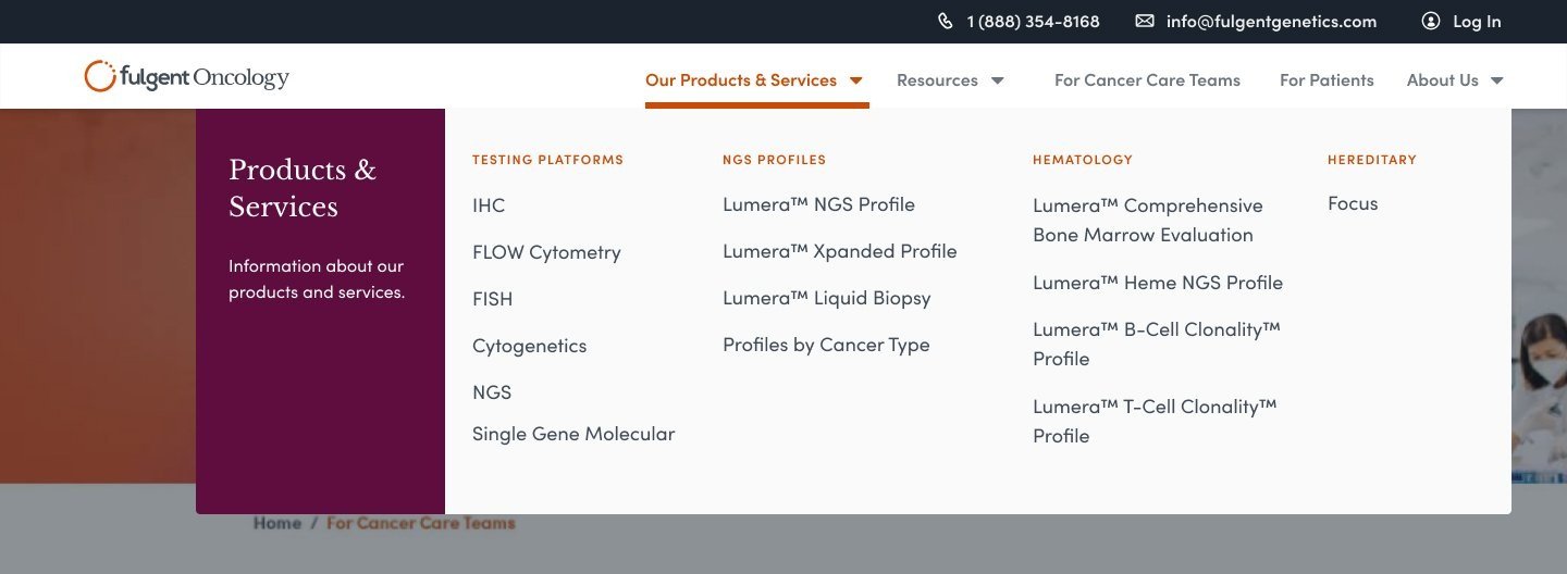
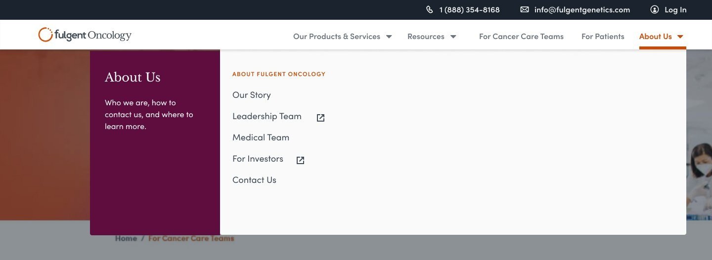
Fulgent oncology Dropdown menu
Fulgent Genetics | UI Design | Prototype | 2022
OVERVIEW
This was an exciting time, Fulgent has just expanded its testing capabilities with the acquisition of CSI Laboratories by offering cancer testing with an expansive pathology menu.
The goal, to create a website centered on offering Fulgent’s new product line, its technology, and the team leaders.
The ask
Dropdown menu
ROLE
Working with the Lead Interaction Designer
Team Involved
Product Manager
Lead Interaction Designer
Engineering (Interface)
Applied Process - Research & Competitive analysis, Visual design & layout, Incorporating product branding, Responsiveness

So many menus…
Let’s See What’s Out There
The objective was to design a menu that is easily navigable but also avoiding to group the contents within thus, lessening the additional clicks for the users.
Filtering What We Have Learned
After sifting through a couple of interactions with competitors’ dropdown menus, there were two that stood out.
Immediate display of all content within the selected menu
An area to display supporting description (left-most column). Great to add a button or a link-out that relates to the content.
1 layer before displaying menu contents
Organized, less clutter

Mocking up the Findings


Iteration 1 - Insights to Consider
Purpose - Does a button necessarily need to be present in the menu?
Impact - Are there enough visual cues for the user experience?
Conclusion
A two-column design approach that utilizes one for user insights and the other for menu navigation.


Iteration 2 - Insights to Consider
Usability - Is it successful in organizing and providing an easily navigable menu?
Impact - Will the navigation cause any concerns? Would the user question, “It would be a lot better if it was…”, or “This could…”?
Conclusion
Great use if there are a lot of subcategories in turn, it lacks quickness in navigation due to the many layers of submenus to go through.
Developing the design
My high fidelity mockups were made in Figma and this is also where the engineering team and I communicate questions and/or concerns about the design and functionality. With mockups beginning on desktop view, I always accompany them with responsive tablet and mobile modes.
Prototyping

Tablet

Mobile

Summary and takeaways
Overall this was a great learning experience on how the behavior and nature of menus. Despite the simplicity of the design, the goal of the objective was not overlooked.
Some key takeaways:
Research & Competitor Analysis - This helps with exposure to similar entities and study and dissect to better narrow down and create effective value props.
An eye for the user - The objective is to cater to the intended demographic on navigating specific products. Always anticipate and question what the user wants and needs.
Teamwork - Constantly aligning with core team members (product manager, lead interaction designer, and engineering) to result in a smooth workflow and rollout.