Fulgent Beacon pages
Fulgent Genetics | UI/UX | Prototype | 2023
OVERVIEW
One of many Fulgent Genetics product offerings is Beacon Carrier Screening. The highlight of Beacon Carrier Screening was one of the goals in 2023. In doing so, a few of the pages on Fulgent’s website received substantial revamping. The revamp was under the project guise, Web 3.0.
The ask
Develop series of marketing pages to highlight the different aspects of operation and information about the Beacon Carrier Screening test.
ROLE
Working with the Lead Interaction Designer and
Senior Graphic Designer
Applied Process - Visual and functional design, layout, responsiveness
Team Involved
Lead Interaction Designer
Senior Graphic Designer
Engineering
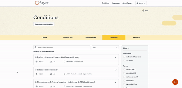
Page 1 - Conditions list
An extensive list of conditions the Beacon Carrier Screening tests.
Conceptualize
The initial phase was to brainstorm how to reorganize the information from the old page design.
Brainstorming
Mocks were created to show different ways to rearrange the list page according to the design principles of Web 3.0. This aims to enhance the visual design of the pages.
Default and expanded states
Visual indicators representing the attributes of a condition on the list
Experimented table/card styles

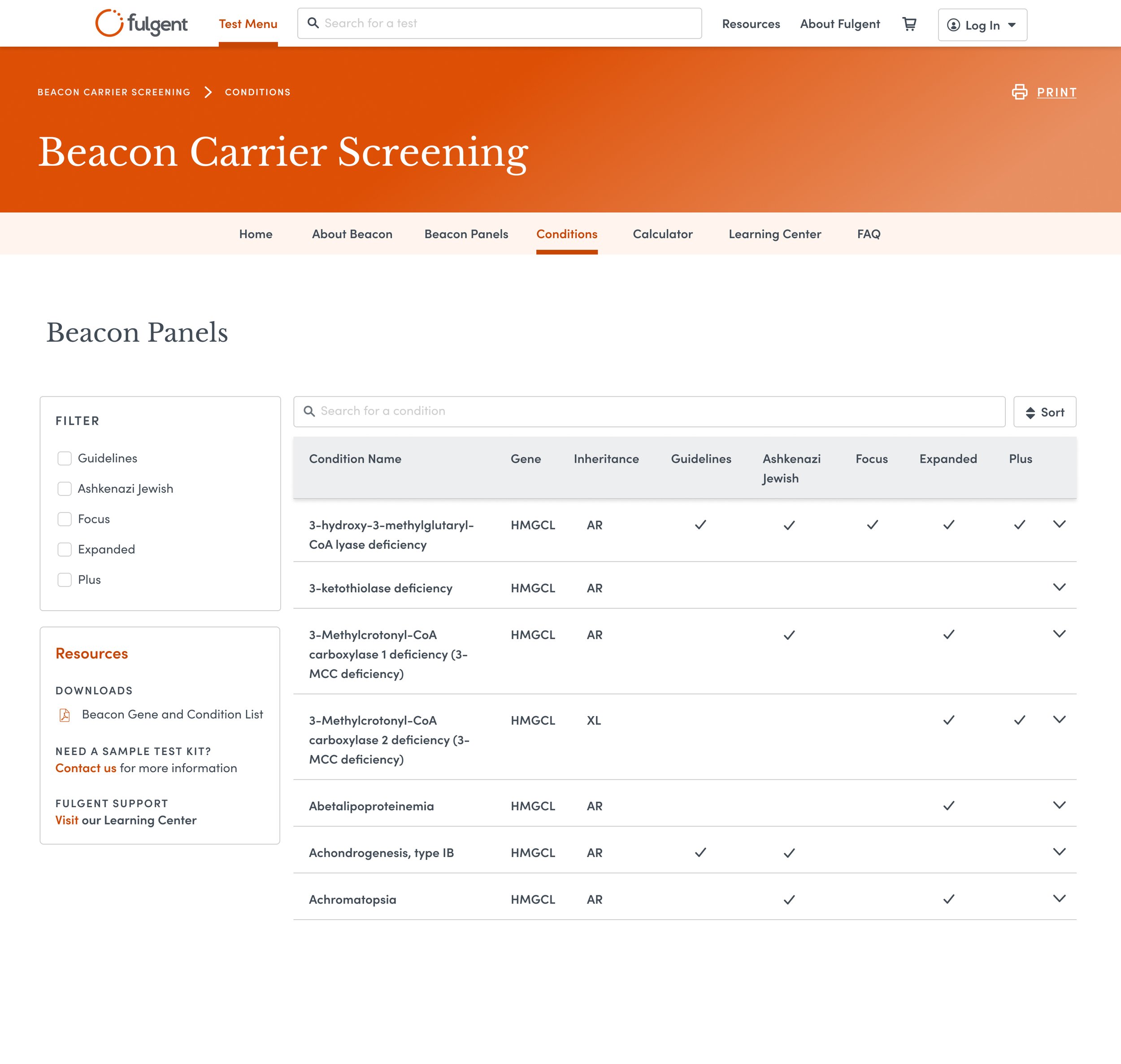


Narrowing down the scope
After consulting with the Lead Designer and tweaking the drafts, we have concluded with a two-column design with a floating filter menu. The card style remains, as it is easily distinguishable between each result. Its utility being collapsable and expandable makes sense here to condense the amount of results and allow us to fit the large amount of content as needed.
Important Elements
Filters and Sorting
Due to the large amount of information being shown from the database, filters and sorting elements were added to ease the user experience.
Mouseovers and Clickable Links
The addition of mouseover hover-state tooltips and clickable links will help users figure out uncertainties/unfamiliar metadata present on the condition cards.

Pagination
We decided to add pagination to help users sift through results more effortlessly. In addition, as well as considered the backend side with this component due to its property to lighten the webpage when loading large amounts of results versus a set amount per page.

How the Condition page looks in production/Responsiveness
Desktop

Mobile
Page 2 - Risk Calculator

Before

After
The initial phase was to brainstorm how to reorganize and improve the usability of the old design.

Design that makes sense
The design that was chosen had a few factors that were considered:
1. A three-column design to include navigation due to the purpose of the page being considered a resource for information.
2. From the initial drafts, having the results above or below is not the best direction in terms of usability and the nature of the functionality. Having the results appear on the right with the two-column design adds a sense of familiarity.
3. Simplified the selectable field options and the radio buttons are now listed.
4. Under the Results panel, created a hierarchy between what result is under what category.
5. Reformatted the visual states of the buttons to easily differentiate the primary versus tertiary.
How the risk calculator page looks in production/Responsiveness

Desktop

Tablet

Mobile
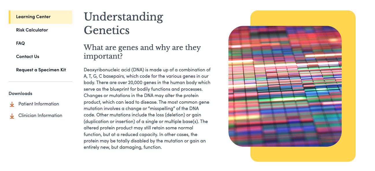
Page 3 - Learning Center
Design
An informational page highlighting the understanding of genetics.
Reworked the diagram graphic to a higher fidelity
Utilized container system to organize and differentiate content

Page 4 - FAQ
Collapsable and expandable card design used due to familiar functionality and usability

Key takeaways and what I learned
Engineering - Constant collaboration with the engineering team to tackle concerns, negotiate specific functionalities of components, and communicate the need for elements that can help the user
Design - Learned a lot about page layouts (2-column), incorporating branding, user-friendly elements, simplification but effective, and applying overlooked details.